the work...
︎
︎
SHOW
DON’T
TELL
︎

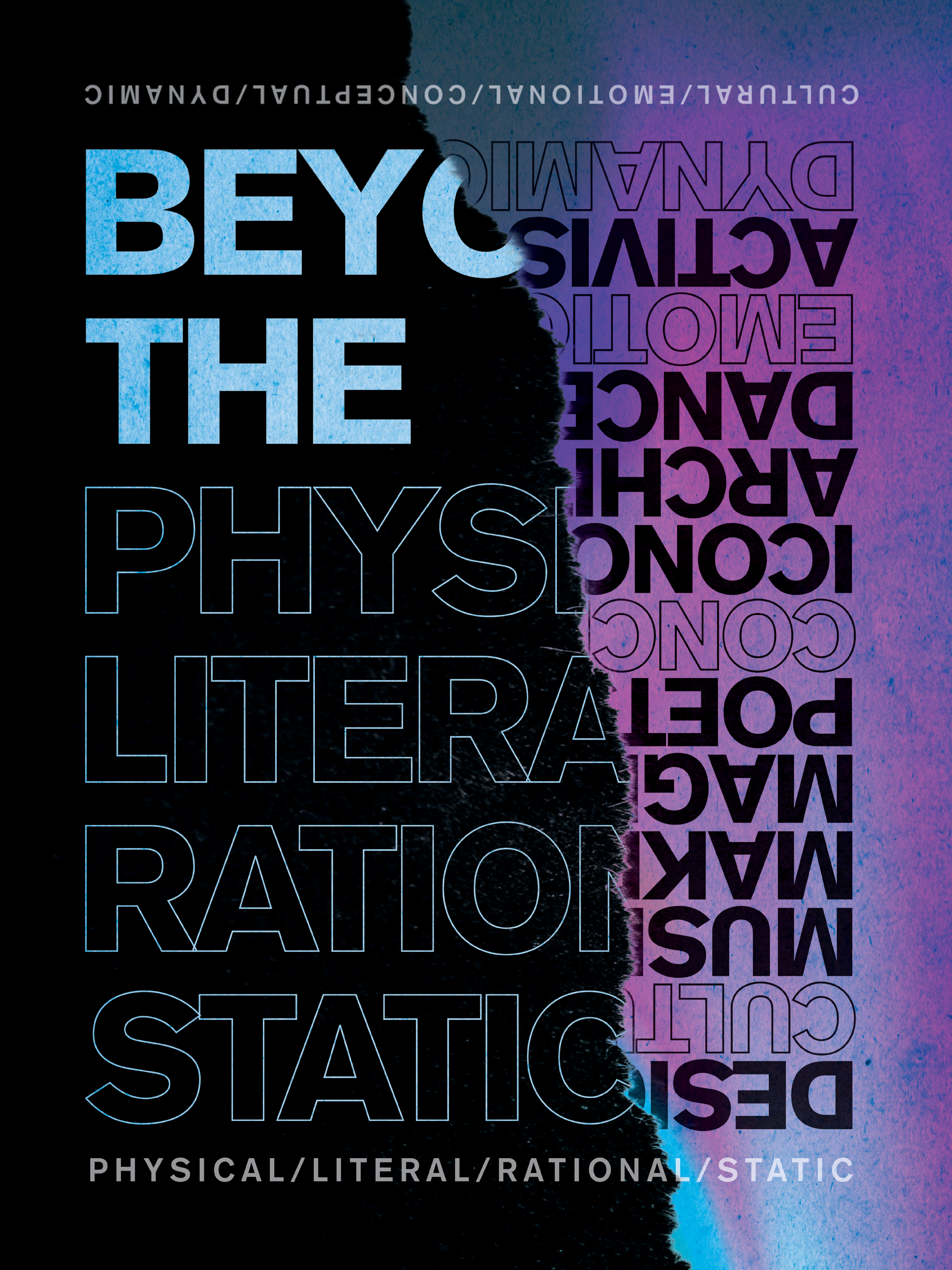


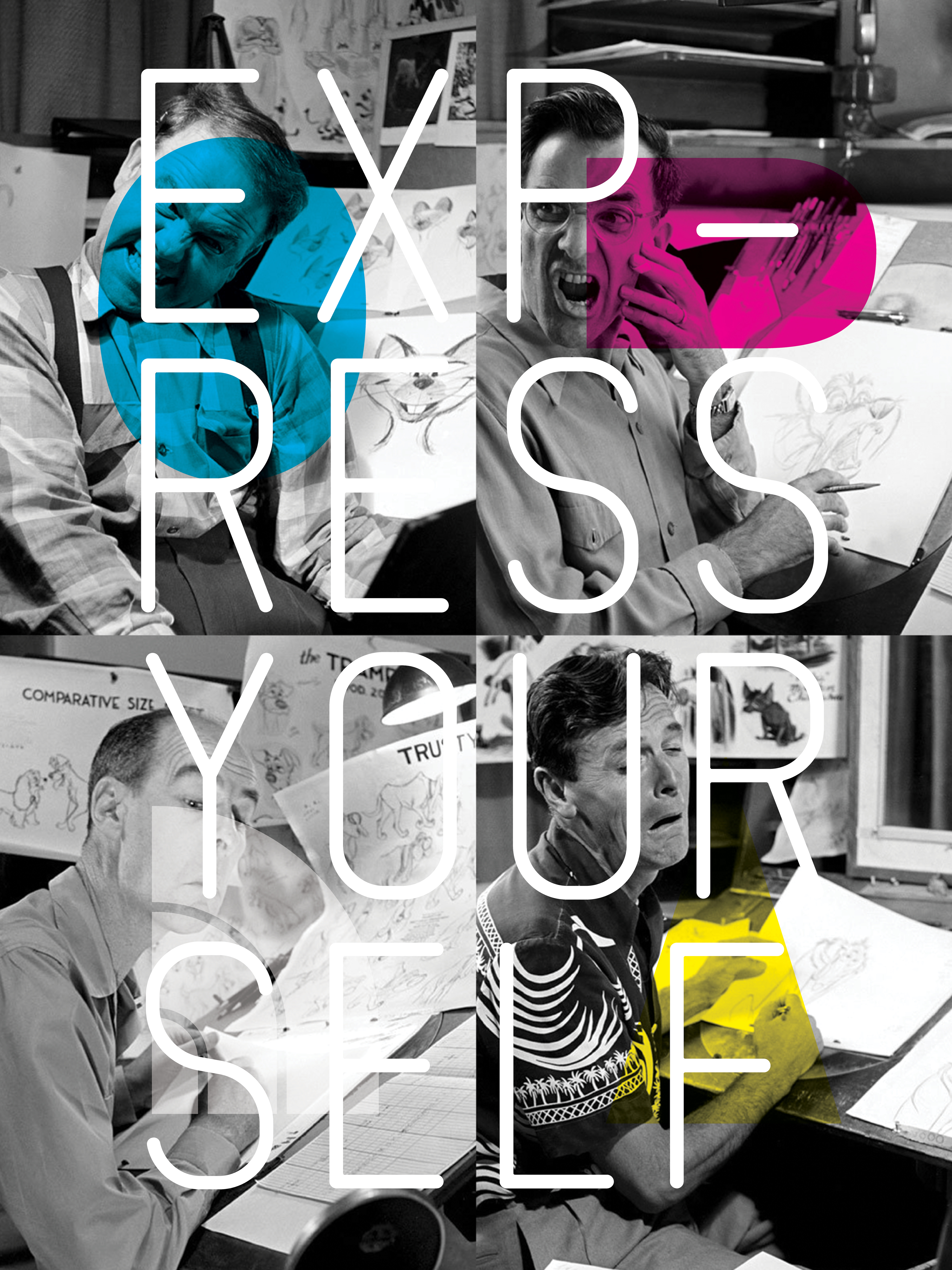

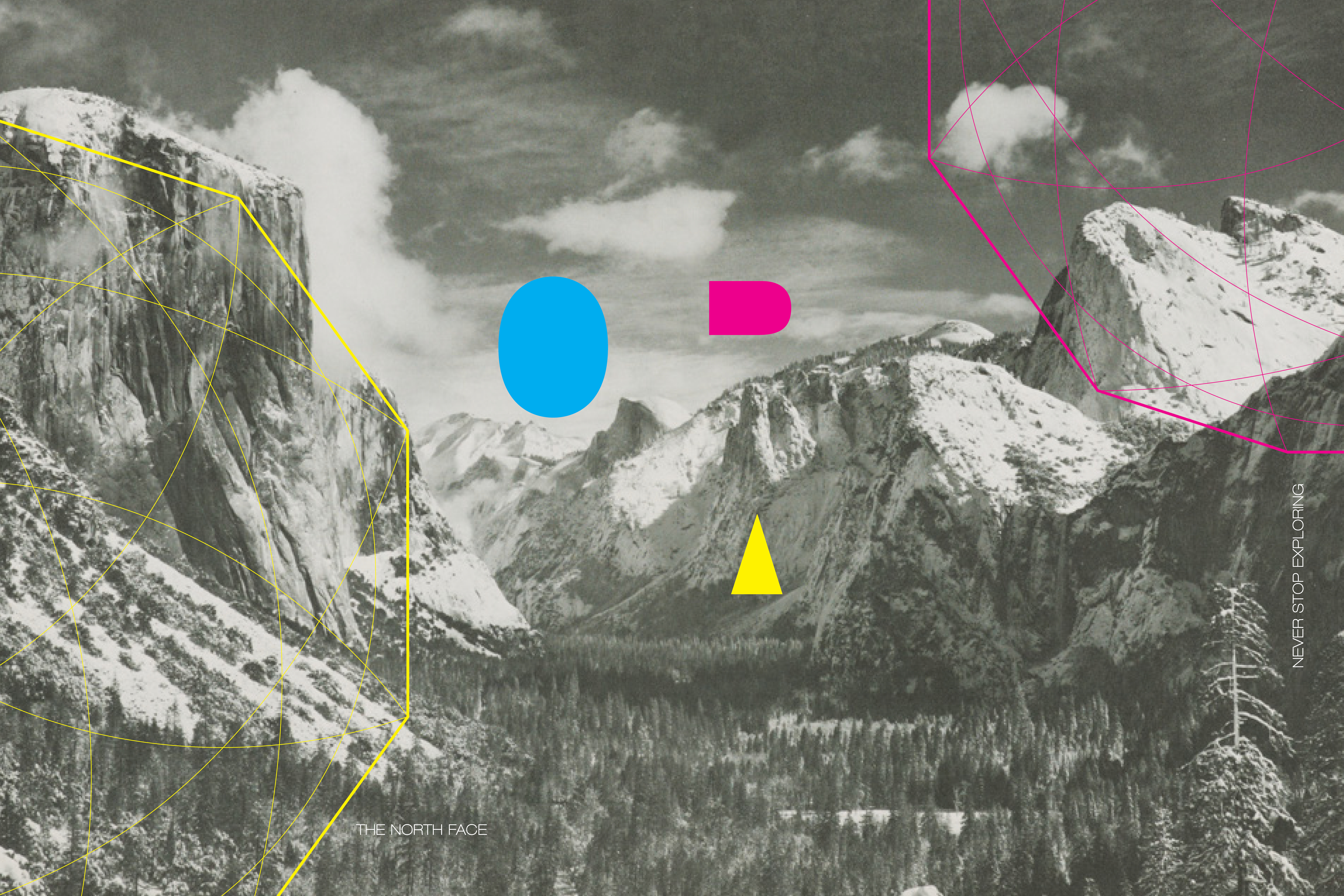

OK, I’ll tell a little bit. Sometimes big creative decks are heavy and dense. Posters and pins are fun. Before the creative team and I dove headlong into what would turn out to be the most substantial creative deck I’ve worked on, we wanted to shift our own behavior with the hopes of provoking a more dynamic conversation and trigger an emotional response from our design teams and the company at large. We concepted and designed a series of posters, engineered a modular DIY installation outside our studio and distributed handmade buttons to push some our conclusions and insights into a more public light and give them some levity.
The posters shown here as flats and the buttons are some of the graphics I designed and contributed to the installation. The below shots show the install mid process and also feature the work of the rest of the creative team who were my partners in crime for this project. In addition to being fun and visually powerful, this creative propaganda is interesting because (if done well) can embed itself into the cultural brain trust. Once ideas become objects, they have the potential to outlive any seasonal/directional origins and plant creative seeds that spawn ideas and connection in perpetuity.
Memetics at work.


︎
Role/Category : Concept design, art direction, graphic design, gentleman anarchy, brand, creative direction
Collaboration with : Peter Valles, Paxton Madison, Makenzie Brown : TNF
Role/Category : Concept design, art direction, graphic design, gentleman anarchy, brand, creative direction
Collaboration with : Peter Valles, Paxton Madison, Makenzie Brown : TNF
︎
MOON
LIGHTING
Timbuk2 X Astro Capsule
︎
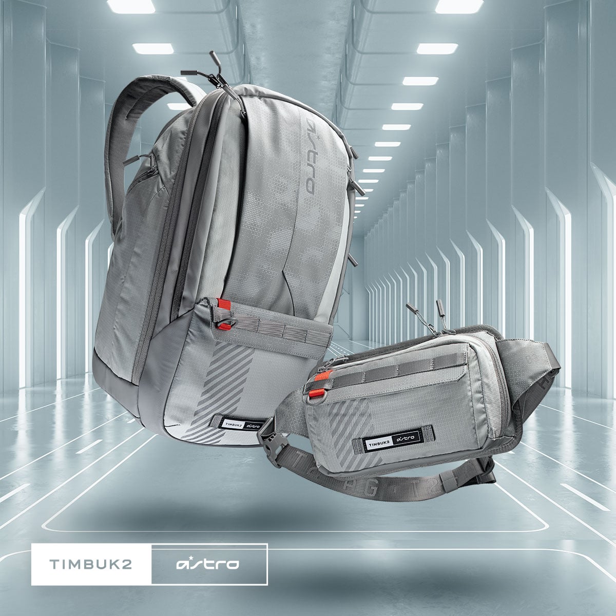


A simple but fun brief and result. Develop a lunar themed print for the limited collab for Timbuk2 and Astro. Inspiration and color pulled from space suiting and ship cladding but aimed at the imaginitive segment of gamers and their kit. Readable but also a bit evocative and pushed through a forward graphic lens.
︎
Role/Category : Concept design, print/ graphic design, creative direction
Partners : Mateo Paduano Timbuk2
Role/Category : Concept design, print/ graphic design, creative direction
Partners : Mateo Paduano Timbuk2
︎
ALL THE RAGE
︎
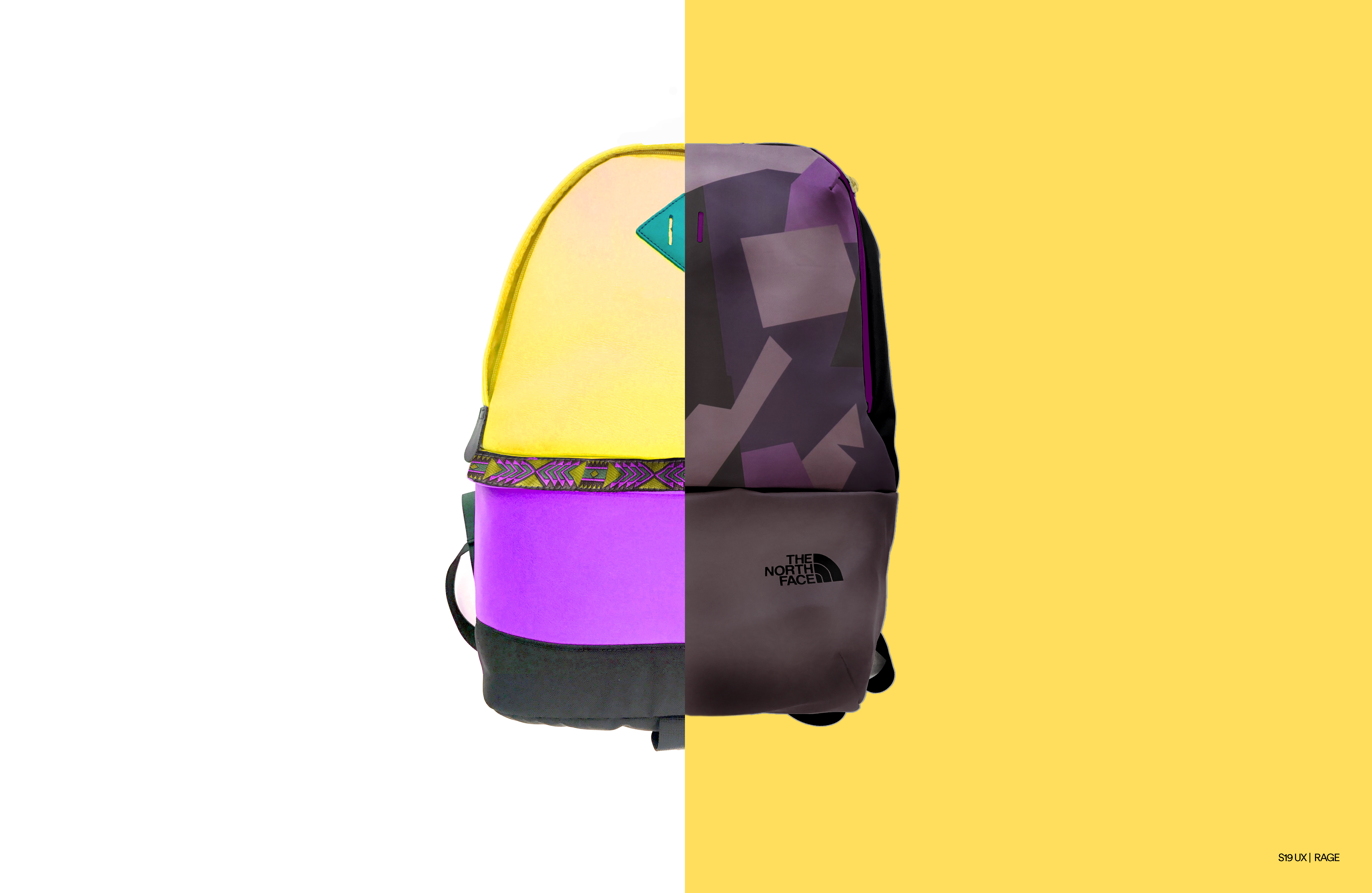
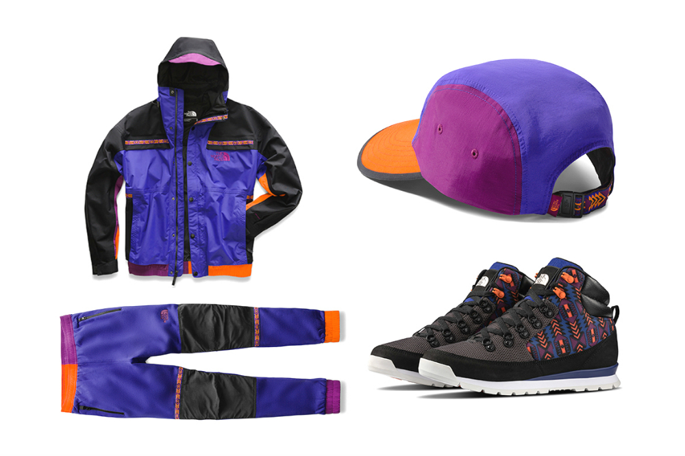
S19 Urban Exploration Global Direction/Collection
2018

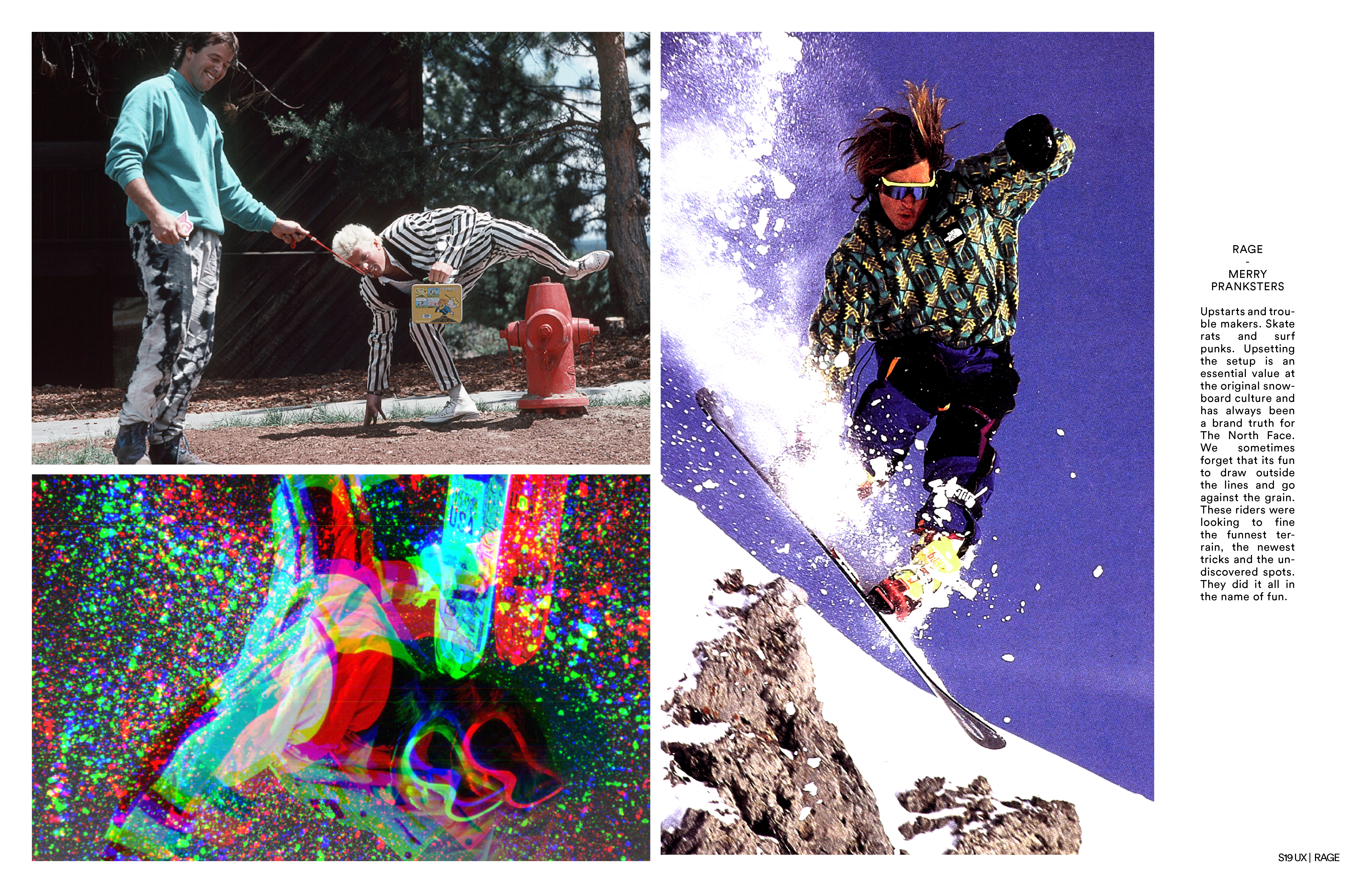


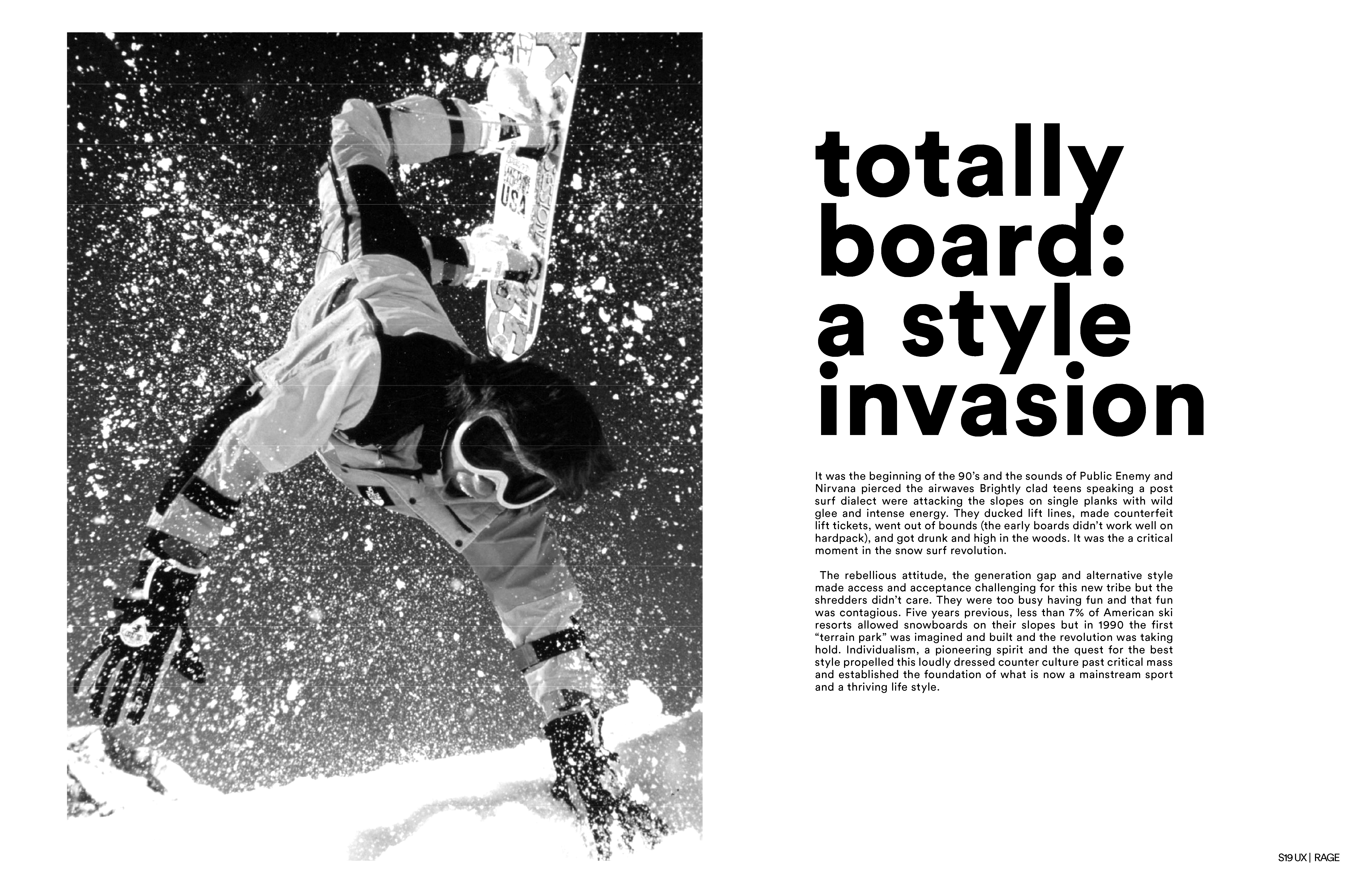
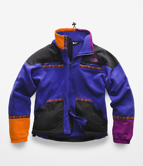
This is a glimpse into the direction/process and some of the thinking that set up the global design teams to ideate, concept, design, build and ultimately launch one of our strongest inline statement collections to date. Bold and commited with a grin.
“Authentically built. Outrageously styled.”
When retro-ing or evolving iconic design language and brand moments special care must be taken to protect the origin story and intent. At the same time, living in the past is a trap so metabolizing that memory and moment into a seed for new thoughts is essential for growth and relevance. Approaching this collection from contrasting yet linked perspectives (past/future) allowed us to honor the OG visual language and spirit of rebellious fun while also considering emerging ideas of protection and cultural deviations.
Know your meme.




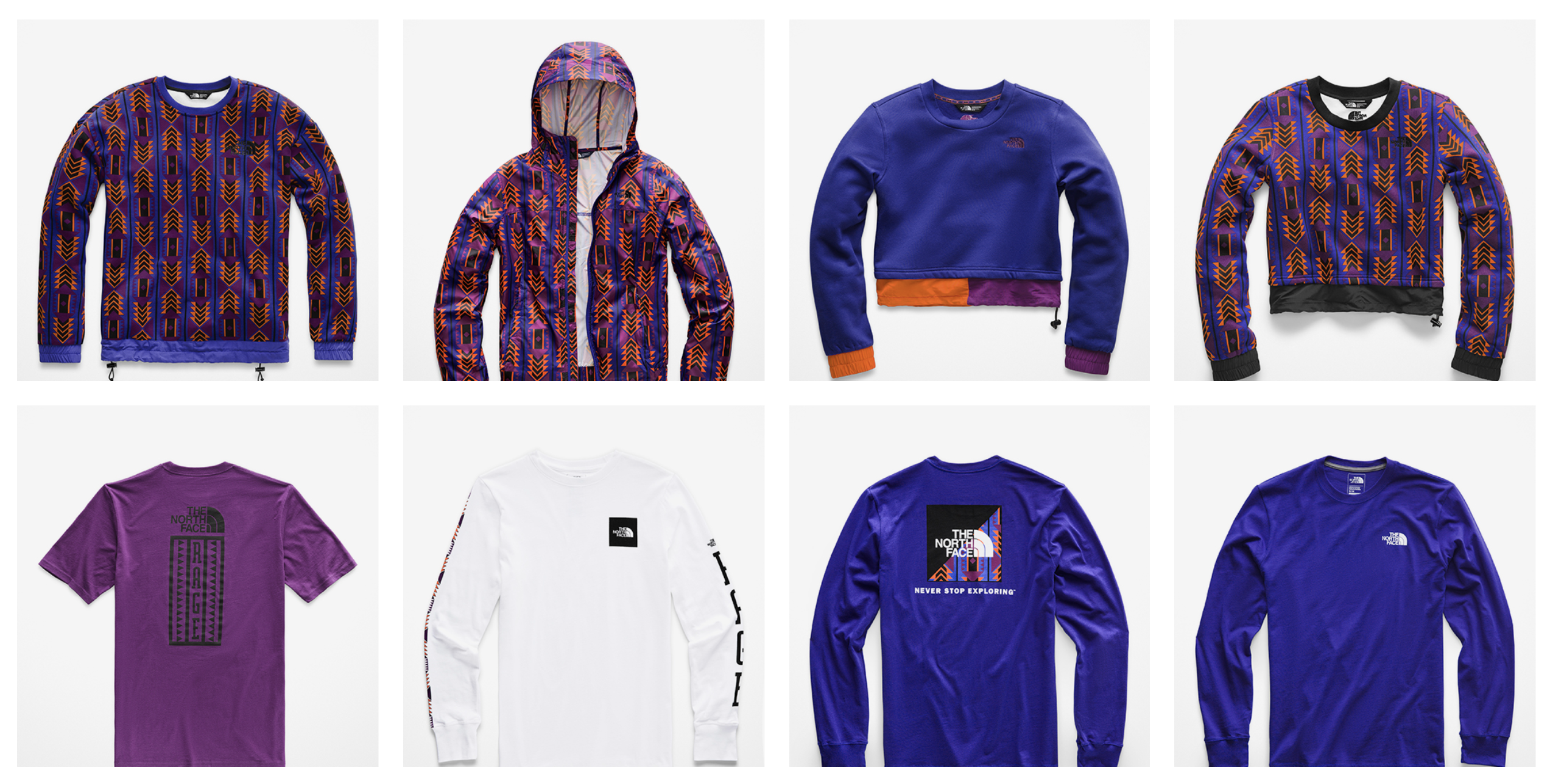

︎
- Creative direction , Design direction
Design - Tessa Luken, Terez Havenzack (sorry if fucked your spelllings up ladies. You guys crushed it!)
︎
︎
NINE
TEEN NINETY NOW
︎
The North Face x
Timberland Capsule
2017

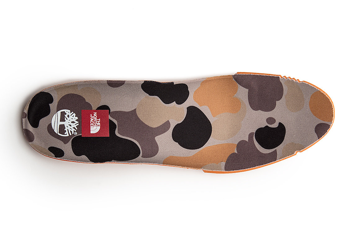

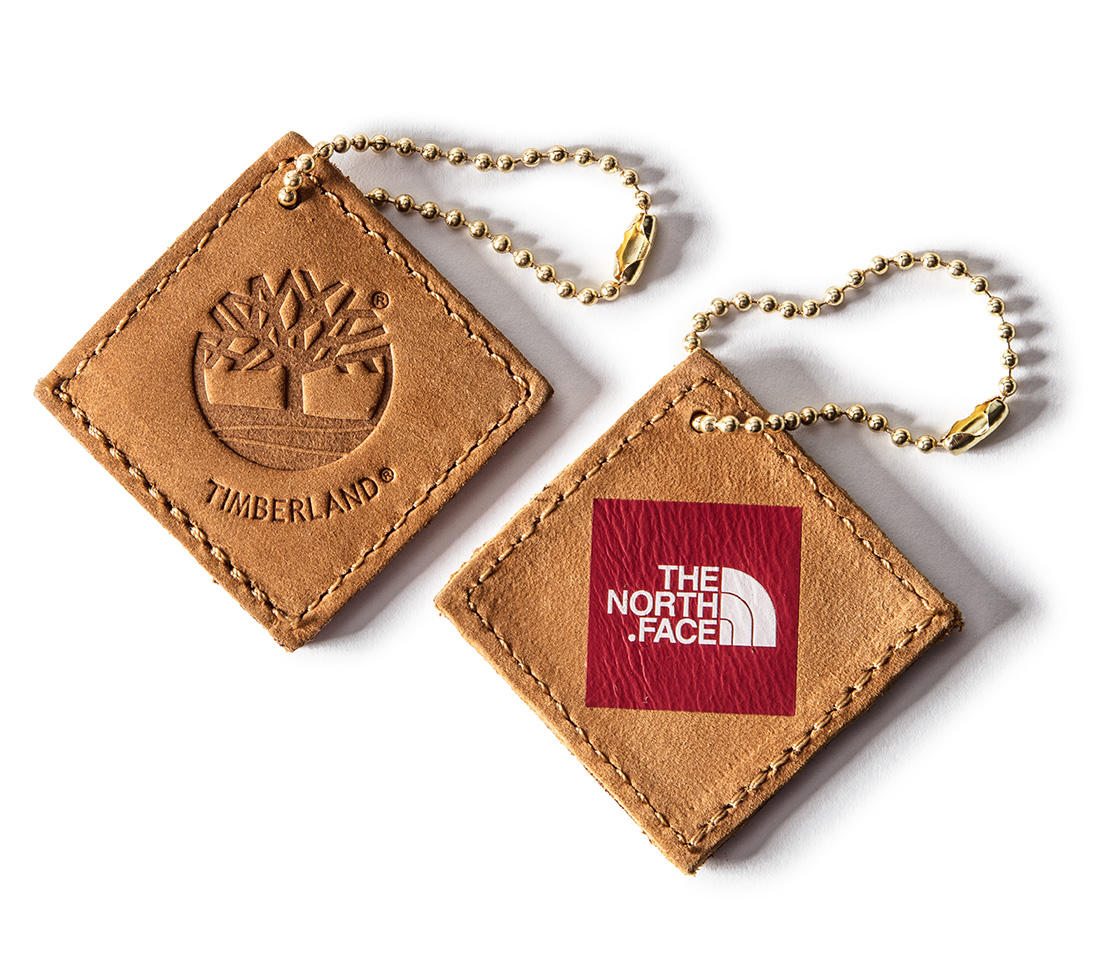
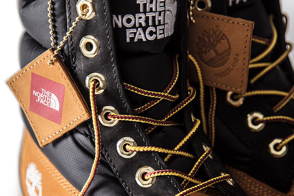
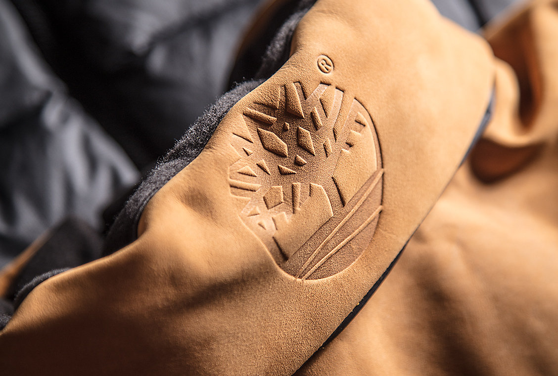
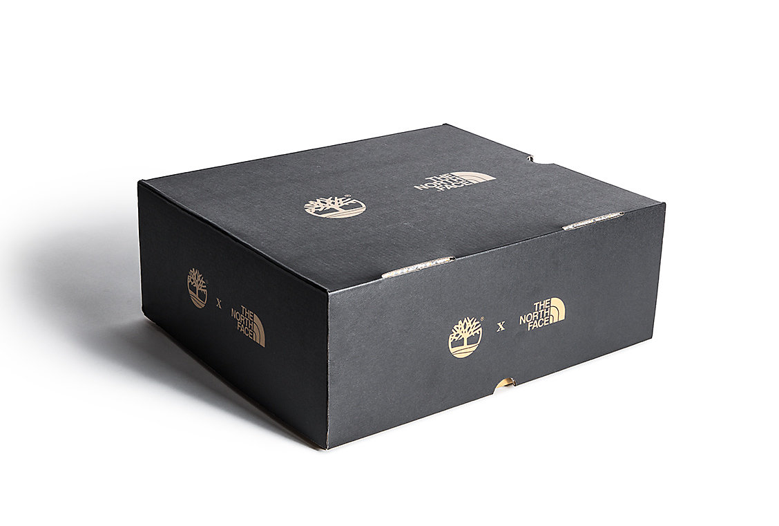
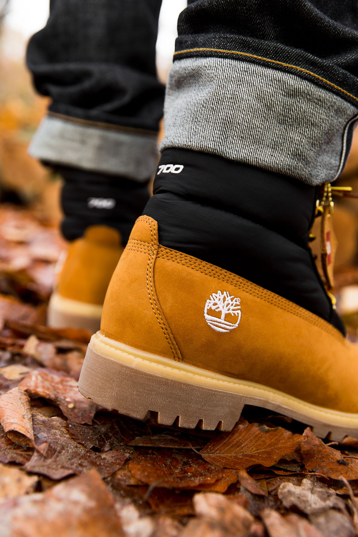
Rugged nostalgia is at the heart of this collaborative effort. Two storied icons converge as the chosen protection of a population armoring themselves against the elements. Cold streets and RZA beats. Although “Tims” and “North Face” puffers are all world natives at this point, New York, New York is the origin of this concept. Recognizing and rewarding the subculture of loyal fans and afficianados in the 5 boroughs who rep our brands was key, so finding the design elements to bridge the Nuptse and Timberland’s insulated boot was the focus. Color, materiality, proportion and a deep respect for both brand origins led us to a tightly connected offering with considered details.
The best collabs manifest something that’s often not possible for a single brand to do on its own. Some results are deeply connected while others feed the hype machine or are self indulgent. Some are organic, some mandated. Some are for dollars and some are for the brands and those who love them. TNF and Timbs are for the people.
Honey wheat dreams and bubble goose wishes.


︎
Role/Catagory - Concept, creative direction (product), design direction, textile design
Product Manager - Scott Ellison : TNF, Timberland partners
Photography - Jonathan Mannion
︎